


Note to the reader: This is the twenty-second in a series of articles I’m publishing here taken from my book, “Investing with the Trend.” Hopefully, you will find this content useful. Market myths are generally perpetuated by repetition, misleading symbolic connections, and the complete ignorance of facts. The world of finance is full of such tendencies, and here, you’ll see some examples. Please keep in mind that not all of these examples are totally misleading — they are sometimes valid — but have too many holes in them to be worthwhile as investment concepts. And not all are directly related to investing and finance. Enjoy! – Greg
One of the basic premises for model development is the concept of Occam’s Razor. Occam’s (or Ockham’s) Razor is a principle attributed to the 14th-century logician and Franciscan friar William of Ockham. This is the basic premise of all scientific and theory building. The simpler of two methods is preferable. Simplest may not necessarily be best, but is a good start.
Everything should be made as simple as possible, but not simpler. — Albert Einstein
It is the only form that takes its own advice: Keep things simple. A model built on sound principles will probably survive the tumult of the markets much longer and better than an overly complex model. Complexity has a tendency to fail, and, unfortunately, usually at the worst time. I always think about the complex algorithms used by Long Term Capital in 1998, when they began to fail miserably. Their complete failure and the foolish effort to tweak them almost took the New York Fed down with them. It seems that, too often, investors associate complexity with viability. That is just not correct.
Simplicity is the ultimate sophistication. — Leonardo da Vinci
There are three primary components to a sound model, and just like a three-legged stool, a model must be stable in all environments. They are:
- Weight of the evidence measurement of market movement.
- Rules and guidelines to show how to trade the weight of the evidence information.
- Strict discipline to follow the process with confidence.
Remove any one of those components, and like the legs on a three-legged stool, the model will tumble. The following discusses each of these components and how they fit together to produce a comfortable rules-based trend-following model. I mention comfortable because you must be comfortable with your model, or else you will constantly challenge it and probably abandon it. The only thing that really matters when judging a strategy is actual, real-time, verifiable results. Everything else is just window dressing.
Weight of the Evidence
The “Dancing with the Trend” model described herein uses a basket of technical measures to determine the overall risk levels in the market place. The model has been constructed so that each technical measure (see Chapter 13) carries a specified weight based on extensive research. These weights (percentage points) are cumulated to derive a total model point measure to build the weight of the evidence. This approach gives one the ability to protect assets in difficult market environments (low weight of the evidence totals) while also allowing one to make tactical shifts to better-performing assets when the investment environment is more favorable (high weight of the evidence totals).
Each of the weight of the evidence components is assigned a weight based on their percentage contribution to the overall model, with the total of all components equal to 100. The weight of the evidence is further broken into four different levels in this example. For example, if the sum of the weights of the indicators is equal to 65, the model would be deemed to be yellow, as the yellow range is from 51 to 80. These ranges and the number of ranges are determined during model development and research. Sometimes, only three ranges are necessary, and, in fact, for most, it is advisable. In this example, I have four ranges, with the middle two considered as transition ranges. This allows the model to absorb some market volatility without penalizing the process.
- 0–30 = Red
- 31–50 = Orange
- 51–80 = Yellow
- 81–100 = Green
An alternative range could also be used. One must decide on how close the stops are in order to determine how many levels, and, in particular, how the middle or transitional levels are used. Like the porridge in the three bears’ story, one is going to be just right (for your model).
- 0–30 = Red
- 31–70 = Yellow
- 71–100 = Green
These levels serve the model concept, as they determine what set of rules to use to buy, sell, or trade up (trade up is the act of replacing current poor relative performing holdings with better-performing holdings). Asset allocation (equity exposure) values are also a function of the weight of the evidence level. There are also three additional Initial Trend Measures (ITM), which provide guidance to the buying and trading up process using the point system. These help refine the various levels using shorter-term trend measures.
The weight of the evidence model uses these primary components that, when used together, help determine the most appropriate asset allocation level as measured by the model. The terminology below of “turning on” refers to the fact that the measurement is indicating a positive or upward trend. In this example, the price-based components are:
- Trend Capturing (one component)
- Price Short
- Price Medium
- Price Long
- Adaptive Trend
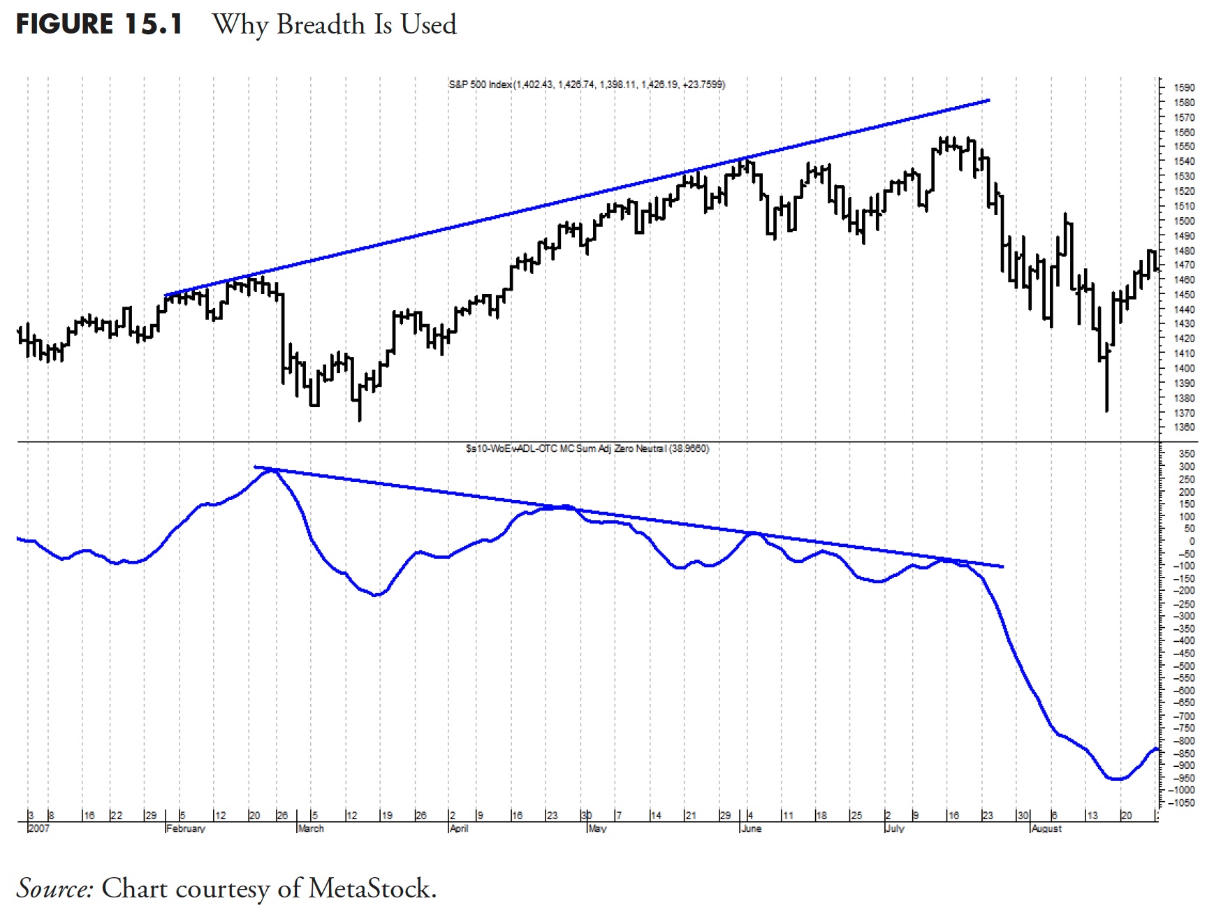
The next group of components fall into the category of Market Breadth measures. Market Breadth indicators allow one to look at the market internals that are not always reflected in the price action of the market. This is much like a physical examination performed by your doctor. You might be feeling fine, but, when the doctor runs his diagnostic tests, he is getting an internal look that can potentially find a health risk that you were not aware of. That is the precise reason it is recommended you have routine physical exams. I’ll spend some time here to illustrate how such Breadth measures can be used to evaluate potential risk in the markets that is not readily apparent in the price action alone.
To use a very simplistic example, let’s focus on the Dow Jones Industrial Average Index (DJIA), which is comprised of 30 large blue-chip issues. If IBM (or another of the high priced stocks in the index) was up 15% on the day, but the other 29 DJIA stocks were down slightly, the DJIA could possibly still be up for the day because of the large price contribution from IBM. The price movement of the index would be showing a positive action. However, if you look at the fact that only one of the 30 was up while 29 were down, a much different picture of the overall health of the market is yielded. Since DJIA is a price-weighted index, this example demonstrates how a high-priced stock can influence the average. Similarly, capitalization-weighted indices (S&P 500) can have cases where the top 10 percent of the components will influence the daily return of the index.
Additionally, the Nasdaq 100 index, which comprises the top capitalization stocks in the Nasdaq Composite, shows that the top 10 stocks of the Nasdaq 100 account for about 43% of the movement of the entire Nasdaq 100 index. The largest capitalization stock in the index can be up $20 for the day, and the smallest capitalization stock can be down one cent for the day, but with breadth, they evenly cancel each other out. Breadth, on the other hand, shows the true internal action of an index from treating all issues equally. Therefore, Breadth measures will generally begin to decline prior to price or cap weighted indexes at market tops. Tom McClellan is fond of saying that breadth arrives at the party on time, but always leaves early.
During periods of market distribution or the long drawn-out topping process, investors will tend to move from their more illiquid higher-risk holdings (usually small cap issues) into what they perceive as less risky large capitalization blue chip stocks. This serves to drive price and capitalization indices (which most are) higher, while breadth, being equally weighted, shows that most issues are declining. As the breadth measures turn off it reduces risk by tightening your sell criteria.
Figure 15.1 is an example from 2007 in which the price-based capitalization index moved higher (top plot of S&P 500), the breadth-based advance decline measure (bottom plot) moved lower.

Here are the breadth-based measures used in this example of the weight of the evidence used in the Dance with the Trend model:
- Advance/Decline
- New Highs/New Lows
- Up Volume/Down Volume
- Breadth Combination
- Trend Capturing (2 components)
The single remaining weight of the evidence component is the relative strength measure. Recall that it is a compound measure using small cap versus large cap, growth vs. value, and breadth vs. price (see Figure 13.24 and Figure 13.25). Figure 15.2 shows the Nasdaq Composite in the top plot, with the total weight of the evidence overlaid on it, and below are all nine weight of the evidence binary indicators. You can see from the individual binaries that they turn on and off independently. As one binary comes on, the total weight of the evidence in the top plot moves up based upon how many points that binary was worth.

Figure 15.3 shows an example of the weight of the evidence in the top plot overlaid on the Nasdaq Composite, going from 100 just after the first vertical line down to zero just before the second vertical line. The weight of the evidence component binaries are all shown below. You can see that as they turn off, the total weight of the evidence line in the top plot declines based on the percentage value of the binary that turned off. Below are the dates and names of the weight of the evidence components and when they turned off. You can see that it took from 5/4/2010 (month/date/year) until 5/20/2010 for all of them to turn off and take the weight of the evidence from 100 to zero. However, don’t forget that, as the weight of the evidence transitions through the four zones, the stops on each holding are tighter, so a nearly defensive position was reached by 5/7/2010.
- 5/4/2010 Adaptive Trend
- 5/5/2010 Trend Capturing
- 5/7/2010 Price Medium
- 5/10/2010 High Low
- 5/17/2010 Price Long
- 5/18/2010 Up Volume Down Volume
- 5/18/2010 Breadth Combination
- 5/19/2010 Advance Decline
- 5/20/2010 Relative Strength

Figure 15.4 shows the total weight of the evidence with the Nasdaq Composite overlaid. When the weight of the evidence is at the top, which is 100, it means all of the components are saying the trend is up. When it is at the bottom, which is zero, it means all of the components are saying the trend is not up. The three horizontal lines are at 80, 50, and 30, which break the weight of the evidence into four sections, which are described in the next section. I think you can clearly see that when the weight of the evidence is strong (> 50), the market is generally in an uptrend.

Investing with the Weight of the Evidence
When all of the indicators are “on,” you have very strong uptrends occurring that have been confirmed by a number of weight of the evidence indicators, meaning there is strong confirmation of the trends in place. There is thus a strong relative strength relationship, in that there is ample speculation taking place in the markets to help drive upward price movement and investor sentiment is good. In addition, the positive price movement is being fully supported by the internal breadth measures. This is a favorable time to be invested, and this is also when you want to participate in the equity markets, because of the favorable opportunity of market gains.
However, when all of the indicators are off, a negative or insufficient uptrend is in place and there is no confirmation of a solid positive trend. The relative strength relationship is showing unfavorable market sentiment, which leads to less-than-favorable market conditions. In addition, the breadth measures are telling you that the market internals are weak. This is a time when the risk of negative price movement is at its greatest, and the time to be invested in much safer assets, such as cash or cash equivalents, until market conditions improve.
Transitional markets occur when the weight of the evidence is either increasing or decreasing. If the weight of the evidence is increasing, one will generally begin increasing the equity allocations as evidence builds, until you get to a point where most or all of the indicators are on, at which time you would have generally moved to a fully invested position. When the weight of the evidence is declining, the stops that are in place on every holding in the portfolio are tightened. These stops, which act as a downside protection mechanism in the event the market price action reverses suddenly, control the sell side discipline, and, if these stops are hit, the positions are sold. Stopped out positions are not replaced until you once again begin to see an improvement in the market’s performance or the weight of the evidence, depending on the rules and guidelines. Therefore, as the weight of the evidence continues to decline (indicators turning off) and holdings continue to hit stop loss levels, one is naturally decreasing the equity allocation until such time that you might be fully defensive. Figure 15.5 shows the Nasdaq Composite with the weight of the evidence composite overlaid and the four levels defined previously.

Table 15.1 shows in table form what Figure 15.5 displays visually.

The technical measures are based on sound principles and solid research, and are applied with uncompromised discipline. This approach to trend following for money management provides a level of comfort to investing in the equities market that few can question.
Ranking and Selection
Chapter 14 presented all of the ranking measures and details on each one. Here, I just bring them into the full picture of how the overall model works.
From the ETF universe (currently about 1,400), using the mandatory ranking measures of Trend, Price Performance, Relative Performance, and Risk Adjusted Return Measures, a fully invested portfolio will contain anywhere from 12 to 18 holdings. (Naturally, the actual number is decided by the strategy team or the investment committee, and this number is used here merely as an example.) The Ranking Measures bring the giant universe of possible ETFs down to only the ones qualified for investment based upon their technical and risk performance. Figure 15.6 helps visualize this ranking and selection process.

Figure 15.7 is a sample of the ranking measures that are mandatory with some of the top-rated ETFs based on the value of Trend. In this particular example, you can see that many fixed income issues ranked high, plus the energy ETFs and a few equity-based ETFs. From this, I would guess the market was in a transition area going from up to down or vice versa, because not many equity-related ETFs are performing well.

Figure 15.8 shows not only the mandatory ranking measures, but also the tie-breakers, all of which were covered in detail in the previous two articles. The conditional formatting allowed in spreadsheet software is invaluable for this process. If the negative numbers are displayed and easily determined, it drastically speeds up and simplifies the selection process.

Discipline
Up to this point in the book, I have given many examples of discipline and its constant need when using an objective model. It is mentioned again here because it is a critically important component. In fact, I think discipline is the sole reason most analysts fail when using a model.
Sell Criteria
Selling of holdings is accomplished in two ways: one is when actively trading up and a holding is sold because it is being replaced by a holding that has better ranking measures, and the other is when a holding hits its stop loss level.
Tweaking the Model
A model that is based on sound principles using a rational approach to measuring trends, a strong set of reasonable rules, and the discipline to follow it (especially, when it seems it isn’t working) is the secret to a successful model process. Tweaking a model is the equivalent of creating destruction. The best models are the ones that are least sensitive to changes in their parameters.
There are times, however, when one of the measures just seems to steadily be losing its trend identification ability. I’m not saying you should never change a parameter or a model component, just don’t start tinkering with the parameters—change the component. In this case, my goal is to find a replacement that only makes a positive contribution to the model’s historical performance, with extremely little or no negative contribution.
Model in Action
The following charts (Figures 15.9, 15.10, 15.11, and 15.12) show the stages of the weight of the evidence model over different time periods. The binary overlaid on the Nasdaq Composite Index is a simplified process that shows an uptrend whenever the Weight of the Evidence measure is greater than 50, and a downtrend whenever it is less than 50. This method shows when the measure is essentially invested (uptrend) and when it is defensive (downtrend). The lower plot is the weight of the evidence composite.


Remember: All of the financial theories and all of the market fundamentals will never be any better than what the trend of the market allows.
Risk Statistics, Ratios, Stops, Whipsaws, and Miscellaneous
This is a wrap-up section that contains important information and concepts, but would have been out of place if put in one of the previous chapters.
Risk statistics are generally good for two purposes: predicting the probability of future outcome and comparing two funds, managers, and so on. If you have read this far, you know I only think they are good for the latter—comparison purposes. When looking at historical returns and standard deviation, you will find that they are not constant, but dependent on the time frame being analyzed. Personally, using less than five years will produce statistics that are not significant for longer-term analysis. Risk statistics come in all sizes and shapes, but comparative risk-adjusted statistics are what we discuss here. These should always be calculated using exactly the same time frames for the two series you are analyzing. Plus, it is good to do this over a number of different time frames, say 5, 7, 10, 15, even 20 years. This section also covers whipsaws, fund expenses, stop losses, and turnover.
Sharpe Ratio
The Sharpe Ratio was created by William Sharpe in the 1960s and introduced as an alternative to the reward-to-volatility ratio. Clearly, in this case, he is assuming volatility is standard deviation.
Sharpe Ratio = (Mean – Risk Free Rate) / Standard Deviation
Here is a simple example: let’s say investment A has a return of 12% and a Standard Deviation of 10%, while investment B has a return of 18% and a Standard Deviation of 16%. Let’s assume the Risk Free Rate is 3%. Then Investment A has a Sharpe Ratio of 0.90 ((12 – 3)/10). Investment B has a Sharpe Ratio of 0.9375 ((18 – 3)/16). Hence, Investment B is a better investment based on this risk-adjusted statistic. The purpose of this example is to show that a higher standard deviation is acceptable if accompanied by a higher return.
Sortino Ratio
Created by Frank Sortino and offered as an alternative to the Sharpe Ratio, the Sortino Ratio is simply the use of downside deviation in the denominator instead of standard deviation. Instead of using the Risk Free return, it uses a user-defined measure of minimal acceptable return. Downside deviation sounds reasonable, but you must be careful in its determination and assess it for the data in question. If you were to determine variability in a long period of data, the downside variation would be different than if you looked at a short term part of the data.
Sortino Ratio = (Mean – Minimal Acceptable Return ) / Downside Deviation
The Minimal Acceptable Return can be set as a function relative to the Mean Return using a rolling return chart.
Correlations, Alpha, Beta, and Coefficient of Determination
These were thoroughly covered in articles 2-5 of Rules-Based Money Management.
Up and Down Capture
Personally, I think this statistic on performance is the most important of all of them. It measures the cumulative return of an investment compared to a benchmark’s cumulative return in both up and down periods of the benchmark. If the value of the Up Capture is more than 100%, then it means that the investment captured more than 100% of the move when the benchmark advances. If the number is less than 100%, e.g. 80%, then it means the investment only captured 80% of the up moves as the benchmark advanced. Down Capture works the same way, only focusing on the downward moves of the benchmark.
For example, we have an Up Year with the Benchmark increasing 20%. If the Up Capture of the investment is 60%, then the Investment made 20% x 60% = 12%. Assume a down year in which the benchmark declined by 40%, the Investment had a Down Capture of 80%, then the Investment returned 40% x 80% = 32%.
Whipsaws
Trend following has one issue that will constantly plague the investor, usually at the absolute least-expected time, and that is whipsaws. I have to admit, I think it just takes experience to get used to whipsaws. I hate them, but I also know that trying to adjust a model based on sound principles so that the ones in the recent past are reduced or eliminated will lead to two things: the performance in the past will probably be reduced, and you have probably reduced the performance going forward and probably without actually changing the overall number of whipsaws. Trying to eliminate whipsaws will often create more and at the worst time—going forward.
Up Market Whipsaw
A whipsaw can occur in both up and down markets. An up market whipsaw is when the market is trending higher, and then experiences a pullback in price such that it triggers a stop loss and a holding is sold. Shortly thereafter, the market resumes its uptrend (see Figure 15.13). You follow your rules on the process of how to reinstate the equity exposure, and you then purchase another asset to replace the one that was sold, or you can repurchase the one that was sold as long as you are aware of wash sale rules.

Down Market Whipsaw
A down market whipsaw occurs in a downtrend after a bottom forms, your trend measures see an uptrend developing, and calls for equity exposure are made, so you buy based on your rules. Shortly thereafter, the market reverses and the downtrend resumes, and the security just purchased is at its stop loss and is sold. This is the most common type of whipsaw (see Figure 15.14) because, when uptrends begin, the Weight of the Evidence is usually low and your trade up rules are not yet into play. When legging into a new uptrend, your goals is liquid exposure—period.

Stops and Stop Loss Protection
A stop loss is generally applied in an effort to reduce a portfolio’s exposure to the risk of downside market moves. These are determined by a number of methods, e.g. a predetermined cumulative loss is reached or on a percentage of drawdown. Stops can be justified from behavior biases such as disposition effect and loss aversion. I think it can be stated that the use of stop loss protection will almost always reduce a portfolio’s return, especially if the returns are not momentum-driven. In other words, the use of stop losses in trend following is certainly better than in mean reversion strategies. Further, they provide an investor with discipline and the potential to reduce risk.
Generally, though, the reality is that although many think they will improve performance, instead the real value of them is in overall risk reduction. On another note, trend following can be best served with using the reversal of trend as the stop loss technique. However, this would require some real stamina in the process, as one can suffer significant losses before most trend-following methods will provide the risk reduction.
Figure 15.15 shows how a moving stop loss system can work. This stop is based on a 5% decline in price from the highest close reached in the last 15 trading days (top oval). Therefore, that highest point reached in the past 15 days moves within the range of prices during those 15 days. In Figure 15.15 you can see the highest close was about midway back in the 15-day range, or 7 days ago to be exact. The plot at the bottom shows the percent decline from the moving 15-day highest close. Hence, once it drops below the second horizontal line at -5% (bottom oval), the stop is reached and the sell order is executed. Don’t waste your time creating elaborate stop loss techniques if you aren’t going to follow them. In my opinion, all stops are inviolable—period.

This stop loss technique works well because it protects the gains from momentum investing. However, there are situations in market action that would cause this stop loss to fail, and that is during a slow nonvolatile decline. Since the stop is based on the moving past (15 days in this example), it is conceivable that the price would decline and the stop would follow it down because the decline did not exceed the stop loss percentage. Although this is rare, it is certainly possible and must be addressed. One solution is to use a stop that is measuring the trend of the holding, such as the Trend measure discussed in Chapter 14. This way, if the price was declining slowly and the percent from previous high value stop isn’t working, the trend stop will catch it before the decline in price becomes an issue.
Stop Loss Execution
This is easy! Execute it when it hits—period. Although it is easy to write this, very often managers fail to live up to this simple creed. I do not know how many times I have heard of a manager that holds a committee meeting when a stop is hit to decide whether to execute it. How truly sad! If you are going to spend time and effort in developing a stop loss process, then why would you question it when it occurs? To me, a stop loss is inviolable.
Now there is an issue with stops and when they hit based on the time of day, but this can be dealt with in the rules of a good model. Here is an example of a stop loss process that considers the time of day. From rules, there is no trading during the first 30 minutes of the trading day. This has historically been referred to as amateur hour and probably not just appropriate for amateurs but professionals alike. There is often a lot of volatility just after the open, as prices seek stability after watching the news and morning futures. I think it is just best to stand aside during this period. The rules also can cease all trading beyond one hour before the market closes. This period of time also has some volatility, but often the time is justified for trade execution, depending on the size of the trade. In any case, the actual trading day is reduced from the market hours to help overcome the uncertainty during those periods and allow execution time.
When within the rules-based trading day (defined above), when a stop is hit, it is executed. However, the execution process can also be defined with rules. For example, when a holding hits its predefined stop, an alert is sent to all involved in the trading process. This identification of a holding hitting its stop starts a 30-minute clock, which, if after 30 minutes the holding is still below its stop or goes below its stop for the remainder of the trading day, it is executed. The 30 minutes is designed to overcome the onslaught of breaking news, Internet, and constant media coverage throughout the day, with the concern that occasionally the news is initially incorrect for whatever reason. Often, a news story about a particular company can cause not only the company stock to decline, but the industry, the industry group, and even the sector that company is in to decline. If you were holding a technology sector ETF and Intel had a bad news blast, it could and probably would affect your technology holding. The 30-minute window from the stop being hit until it is executed allows any incorrect reporting to be corrected. Often, you can see this in intra-day charts: a spike down, followed a few minutes later by a return to the previous price level.
The bottom line is that you should have a process predefined on how to handle stops. It can be as simple or as complex as you feel comfortable with, but you must follow it.
Thanks for reading this far. I intend to publish one article in this series every week. Can’t wait? The book is for sale here.